Do you find that your landing page conversion rates are lower on mobile devices than on desktops or tablets?
Do you want to improve further on your mobile landing page conversion rates?
Whichever it is, you will be able to improve your mobile landing pages with these A+ tips.
You have probably already heard that people are more mobile than ever, so you don’t need me to remind you… oh, wait I just did.
So you already know that designed landing pages for mobile first is important but do you know exactly what it takes to have a grade A+ mobile landing page?
Good news is that I’m going to tell you how.
Here is how to make your mobile landing page experience A+ with ease:
Keep Text Size and Button Size Legible
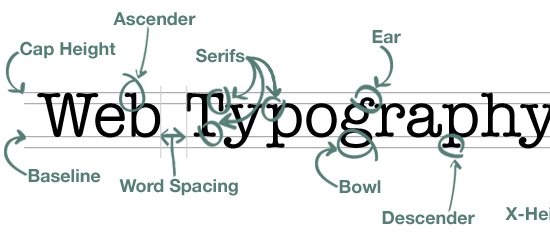
Image Source: B-creative
It doesn’t take a genius to work out that the screen size of a mobile device is a lot smaller than that of a desktop.
Even though this is obvious, there are still businesses and marketers who have not yet altered the text or button size on their mobile landing pages or have chosen to ignore it.
The idea is to make the experience a lot easier for people landing on your landing page and letting them easily read and click on buttons to convert.
If you have text on your mobile landing page that forces people to zoom in and squint their eye, then it is not a mobile friendly landing page.
If you have buttons or clickable links on your mobile landing page that people have to zoom in to click then, your haven’t got a mobile friendly landing page.
Make sure that people can easily read and click the buttons on your mobile landing page without having to zoom in.
Minimize Distractions “Clear Not Clever.”
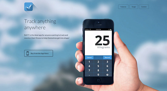
Image Source: DesignBump
We all get a bit excited when it comes to designing our landing pages and can sometimes get a bit carried away and forget the basic principles.
Try not to let your inner designer take over and just aim to create a mobile landing page that is simple and clear and not too clever and full of invaluable distractions.
With mobile devices, you only have a small space to get your point across and entice the user to stay on your landing page.
To do this, you will need to have a clear headline which mentions what you’re offering, a list of the main benefits of the offer, compelling call to action and a short form.
These are the main things you need on your mobile landing page so make sure these are clearly visible and aren’t distracted by popups and images.
Keep Popups Well Designed
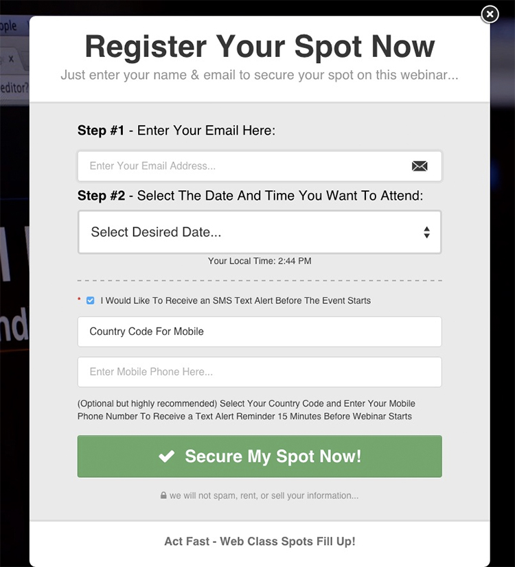
Talking of popups, if you decide that you want to include a popup on your mobile landing page, then it is important that it is well designed and well timed so as to not frustrate the user.
Some businesses have popups on their mobile landing pages that cause more of an obstacle than something that is helpful to the user.
One of the biggest problems with popups that I come across when using my mobile device is that they are too big for the screen.
When they are too big, I cannot find the close button, so I end up just clicking back to the search results page or social network.
This frustrates me and automatically makes me have a negative opinion on that brand.
While popups may be something you want, it is important to think about what the user wants to improve usability.
Do your users want to see your popup on your landing page?
Create User Personas
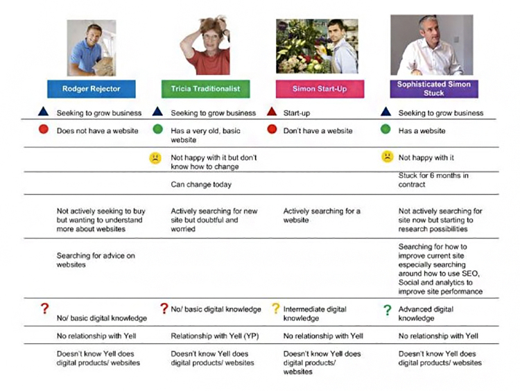
Image Source: Kissmetrics
The one thing so many businesses and marketers forget is to create user personas.
These personas will help you better design you mobile landing page.
For example, after looking in detail into your customer details, you may notice that there are a large number of customers who tend to travel a lot.
It is these customers that are more than likely going to be landing on your page from their mobile device.
You will be able to portray better your message on your mobile landing page to target this particular customer persona.
You will not be able to tailor the content or design of your mobile landing pages to suit each customer persona without knowing every detail about your existing customers.
You need to find out their goals and challenges so you can tailor the content, design and what you are offering on your mobile landing pages to improve their experience.
Offer Something Of Value

While you may have a mobile landing page with the readable text, no distractions, no popups and with everything else being perfect, it may still not convert if what you’re offering isn’t of value to your users or if there is no offer at all.
Make sure that you are offering something that will be helpful to them so as to improve the whole experience.
This could be a free 14-day trial, a downloadable report filled with unique statistics or a downloadable guide.
Offering something vague such as “more information” or a call back will not entice them enough to give up their contact details.
Keep Your Form Short
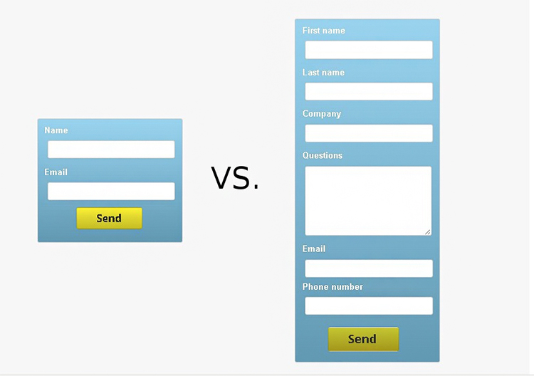
Image Source: TruConversion
As I have mentioned a couple of times already, you only have a small space to display elements of landing pages such as images, headlines and call to actions.
Because of this, it is important not to intimidate users by having a form that is too long that they need to scroll.
Having a form that it too long could scare users and force them to click back to wherever they came from and pushed them to a competitor.
Make converting easy for them by only asking for information that is 100% necessary for conversion.
This could be as simple as asking for their name and email address.
Do you need to know their home or office address?
Do you need to know their phone number right now?
Do you need them to leave their comments?
Ask yourself whether you need each field on the form. If you don’t… get rid!
Make Sure Your Call To Actions Aren’t Overlooked
The call to action on your mobile landing page is one of the most important factors as it is what directs the user what to do next to receive their offer.
Because of how important this is, it is crucial that it can be easily seen on the mobile landing pages.
To do this, do not clutter the landing page, so it distracts the eye away from the call to action and also make sure that it stands out from the page.
You can make a call to action stand out from the page by making the color of the button a contrasting color to the background and any other elements around it.
Add Scroll Cues

Image Source: Pagewiz
If you offer videos or further information on what you are offering, it is important to let users know that the information is there, especially if it will help them convert.
You can do this by adding scroll cues to your mobile landing page.
These are mostly used as arrows pointing down so users know that they can scroll down to find more content.
Without scroll cues, it can sometimes not be as obvious that there is more to a mobile landing page than the initial above the fold section.
Add A Click To Call Phone Number
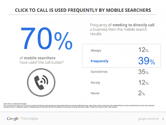
Image Source: ConversionXL
People using mobile may want to have quick access to information which is why they are looking to call someone who can help.
If you don’t offer a click to call the phone number on your mobile landing page, then users may click away and find someone who does.
If people are looking for quick information, then the last thing they want to do is to go looking for a phone number.
Improve the usability of your mobile landing page by offering a click to call a phone number.
This is especially important for businesses that tend to have customers who need help quickly such as locksmiths where customers lock themselves out of their cars or homes.
Make Sure It Loads Under 2 Seconds
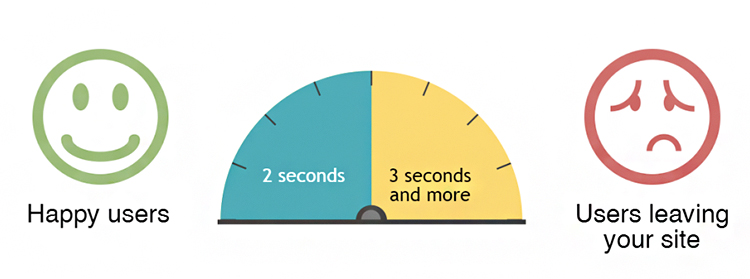
Image Source: SEOAnalytics
One of the biggest improvements you can make to your mobile landing page is to work on it so that it loads in under 2 seconds.
There is nothing worse than clicking through to a page to only be presented with nothing but a loading icon.
There are some great tools you can use to test whether your mobile landing page loads under 2 seconds.
You can also use Google’s Page Speed Insights to see what you can fix on your mobile landing page to speed the loading time up.
Conclusion
You should have plenty of ideas to go away and review your mobile landing page with.
Remember when testing and optimizing your mobile landing pages that the user always comes first, so don’t add anything that you want which may damage the experience.
What types of successes or challenges have you faced with your mobile landing page?
Let us know by leaving your comments below.

