Landing pages are an essential component of any well-designed sales funnel.
Here’s what we are going to discuss today:
- What is a landing page?
- What are the three different types of landing pages?
- When should you use each of the three types of landing pages?
We will also share landing page examples that will hopefully provide you with inspiration for your own landing page.
Ready to learn how to use landing pages effectively?
Continue reading…
What is a Landing Page?
A landing page is a web page that is designed to get the visitor to take a specific action.
That action can be:
- Subscribing to your email list
- Downloading your lead magnet
- Scheduling a free consultation with you
- Signing up for a free trial
- Buying your product
…etc.
In other words, the purpose of a landing page is to get the potential customer to take the next step in your sales funnel, whatever that next step is.
Lead Generation Pages vs. Sales Pages
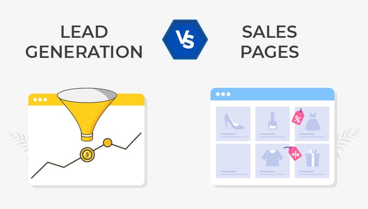
Landing pages can be divided into two categories:
Landing Page Category #1: Lead Generation Pages
Lead generation pages are designed to get the visitor to provide you with their contact details.
This category includes pages that encourage people to subscribe to your email list, download your lead magnet, schedule a free consultation, try a free app, sign up for a free trial, etc.
Landing Page Category #2: Sales Pages
Sales pages are designed to get the visitor to buy your product.
This category includes pages that encourage people to make a purchase and is characterized by the “Buy Now” (or similar) call to action.
Note that although both lead generation pages and sales pages are landing pages, when online marketers use the term “landing page”, they are usually referring to a lead generation page.
3 Different Types of Landing Pages
There are three different types of landing pages:
- Short-form landing pages also known as squeeze pages
- Medium-length landing pages
- Long-form landing pages
Let’s take a closer look at each of these three types of landing pages…
Landing Page Type #1: Short-Form Landing Pages
A squeeze page is the most basic landing page designed to collect email addresses.
Creating one is a great way to get started with landing pages. It may not be the most persuasive page ever but it’s certainly better than nothing. Plus, you can always replace it with a more sophisticated landing page later on.
Keep in mind that landing pages this short aren’t used as sales pages because getting someone to hand you their hard-earned money typically requires more persuasion than what a squeeze page can offer.
The 3 Key Elements of a Squeeze Page
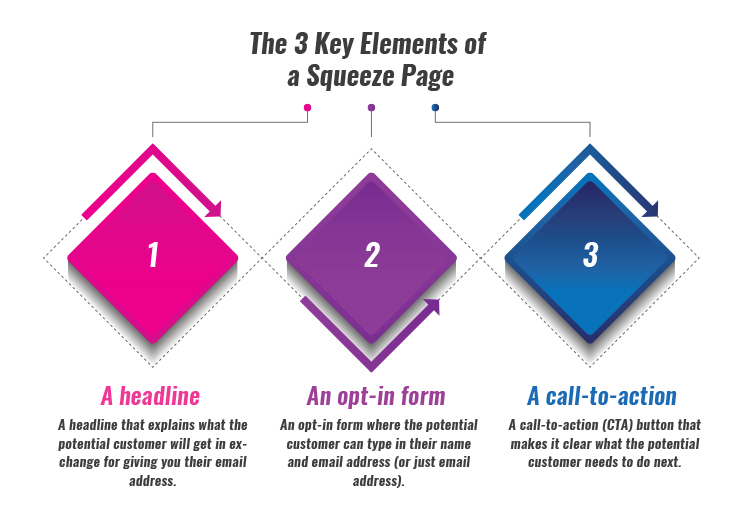
So what are the three key elements of this most basic of landing pages?
- A headline that explains what the potential customer will get in exchange for giving you their email address.
- An opt-in form where the potential customer can type in their name and email address (or just email address).
- A call-to-action (CTA) button that makes it clear what the potential customer needs to do next.
Of course, these three elements would only make for a bare-bones squeeze page, so don’t expect it to convert extremely well.
But then again, a basic landing page is better than no landing page, so a humble squeeze page like that can be a start.
Other Elements You Can Add to a Squeeze Page
You can make your squeeze page more persuasive by adding these additional elements:
- A relevant image – This would typically be a photo of you if this is your personal email list, an image of the lead magnet if you are offering one, or an image that is somehow relevant to your brand.
- A little bit of copy – A few sentences of copy can help the potential customer better understand why they should give you their email address. What will they get in exchange?
- Social proof – Why should the potential customer believe you are legit? You need to give them a reason.
The best way to boost your credibility is through social proof. Of course you think that you are great but what do other people think about you?
You can provide social proof in the form of “As Featured On…” media badges, quotes from email subscribers, quotes from well-known people, etc.
Adding these elements to your squeeze page doesn’t take much time but it can substantially increase its conversion rate. It’s well worth the effort!
Squeeze Page as a Homepage
Using a squeeze page as your homepage has become increasingly popular.
There are two ways to do that:
- Display just the squeeze page on your homepage.
- Display a combination of a squeeze page + a regular homepage.
Let’s take a look at an example of each option…
Example: OkDork Homepage
Noah Kagan is the founder of AppSumo and Sumo and the host of the “Noah Kagan Presents” podcast.
He also has a blog called OK Dork. Take a look at its homepage:
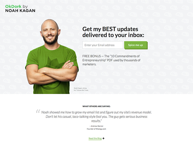
As you can see, Noah is using a squeeze page as the OK Dork homepage.
It has the three key elements:
- A headline
- An opt-in form
- A call to action
As well as the additional elements:
- A photo of Noah
- A little bit of copy that describes the lead magnet
- A quote from Andrew Warner, someone that people in the target audience are likely to be familiar with
Also, pay attention to how Noah lets his personality shine through. He is known for being a laid-back, down-to-earth guy who loves tacos. All that comes through in the squeeze page (there’s even a taco reference!).
Of course, this only works if your personality matches the “vibe” of your target audience, which in Noah’s case it does.
You might need to tone it down if your ideal customers are people who take themselves super seriously.
Example: Nathan Barry’s Homepage
Nathan Barry is the founder of an email marketing software company ConvertKit.
He uses a combination of a squeeze page and a regular homepage on his personal website.
You see the squeeze page above the fold:
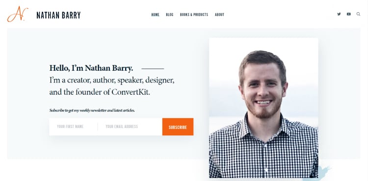
Then below the fold there’s more information about Nathan, such as the fact that he’s a web and app designer…

…an author of three books…
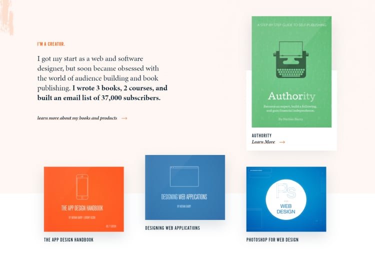
…and the founder of ConvertKit:
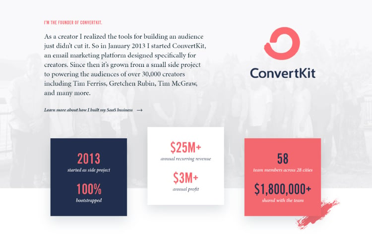
Then there are links to his most recent blog posts and podcast episodes:
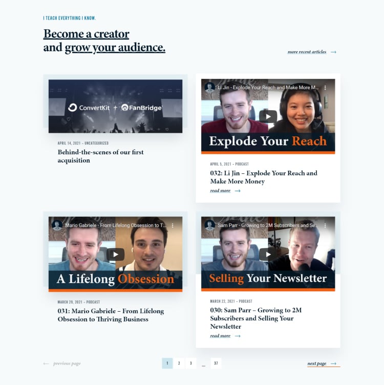
Finally, there’s a footer which includes another opt-in form as well as a bunch of relevant links:
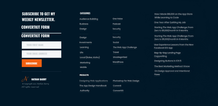
This type of homepage is the best of both worlds:
The squeeze page above the fold increases its conversion rate meanwhile the content below the fold allows the potential customer to get to know you better.
Squeeze Page as a Separate Page
You can also have a separate squeeze page that you then drive traffic to.
Example: Jon Morrow’s “52 Headline Hacks” Squeeze Page
Jon Morrow is a popular blogger and world-renowned writing coach.
Take a look at his “52 Headline Hacks” squeeze page:
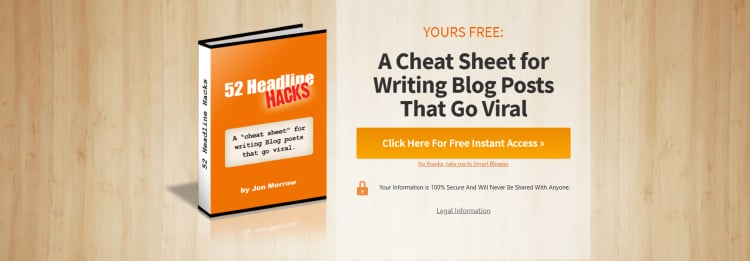
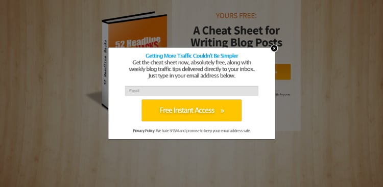
This is an example of a 2-step squeeze page where you have to click the CTA button to see the opt-in form:
Squeeze Page as a Pop-Up
Squeeze pages are also often displayed as pop-ups:
- Welcome pop-ups – These are pop-ups that are shown to the visitor immediately after they land on your website.
- Timed pop-ups – These are pop-ups that are shown to the visitor after they have spent a specific amount of time on your website (say, 5 minutes).
- Event-triggered pop-ups – These are pop-ups that are triggered by specific events (say, the visitor has reached the halfway point of your blog post).
- Exit-intent pop-ups – These are pop-ups that are shown to the visitor when they are about to leave your website. At that point, you have nothing to lose, so you can make one last-ditch attempt to get their email address.
Pop-ups present an interesting marketing dilemma:
- On the one hand, everyone hates them, so you might end up alienating potential customers.
- On the other hand, they work!
It’s important to strike the right balance:
You don’t want to annoy people too much but you also don’t want to miss out on those extra email subscribers that sign up via pop-ups.
Example: Derek Halpern’s Social Triggers Pop-Up
Derek Halpern is a popular blogger and an online marketing expert.
Take a look at this exit-intent pop-up that he uses on the Social Triggers homepage:
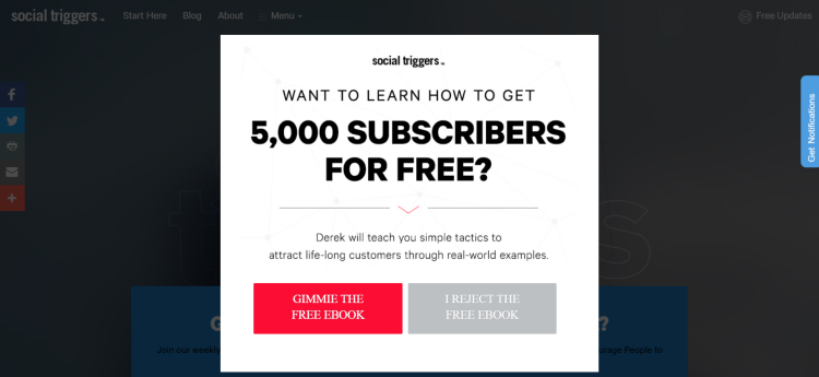
Note the copy on the two buttons:
- “GIMME THE FREE EBOOK”
- “I REJECT THE FREE EBOOK”
Phrasing it that way might make the potential customer stop and think. Do they really want to reject that free ebook?
Of course, you shouldn’t go overboard with this stuff – using copy like “I want to stay broke” comes across as sleazy and manipulative.
It’s best to follow Derek’s example and stick to the factual statements like “I reject the [lead magnet]”.
Landing Page Type #2: Medium-Length Landing Pages
Medium-length landing pages have the same elements as squeeze pages but they are longer because they feature:
- More copy – There’s usually a detailed description of the lead magnet + a bio of the person who is offering it.
- More images – There are typically several images of the lead magnet as well as various images that serve the purpose of breaking up the text.
- More social proof – Instead of one quote or a testimonial, there are usually several of them, plus anything else that can boost credibility (media badges, number of products sold, relevant credentials, etc).
Medium-length landing pages are used to:
- “Sell” a lead magnet
- Sell an inexpensive product (typically in the $10 – $100 range)
Note that if the landing page in question is a sales page, then what we call a medium-length landing page would be considered a short-form sales page.
Example: Nick Stephenson’s “Your First 10k Readers” Landing Page
Nick Stephenson is a best-selling author and a business coach who teaches writers how to market their books.
He offers a free 7-day course as his lead magnet.
Its landing page looks like a squeeze page at a first glance with a headline, some copy, and a call-to-action button above the fold:
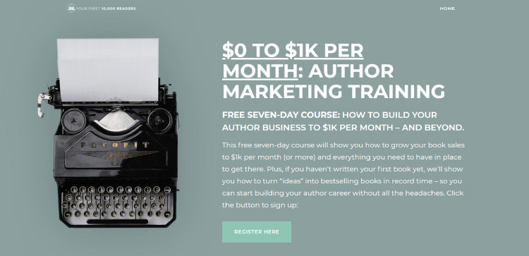
But as you scroll down, you realize that there’s way more to this landing page than that.
Right below the fold there’s a video:
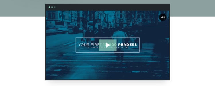
Then there’s a glowing testimonial from a NYT bestselling author:
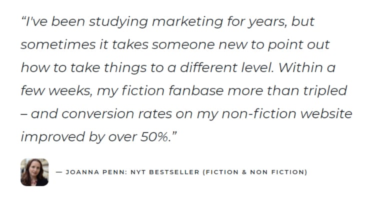
Then there’s an explanation of what you will learn in this free course:
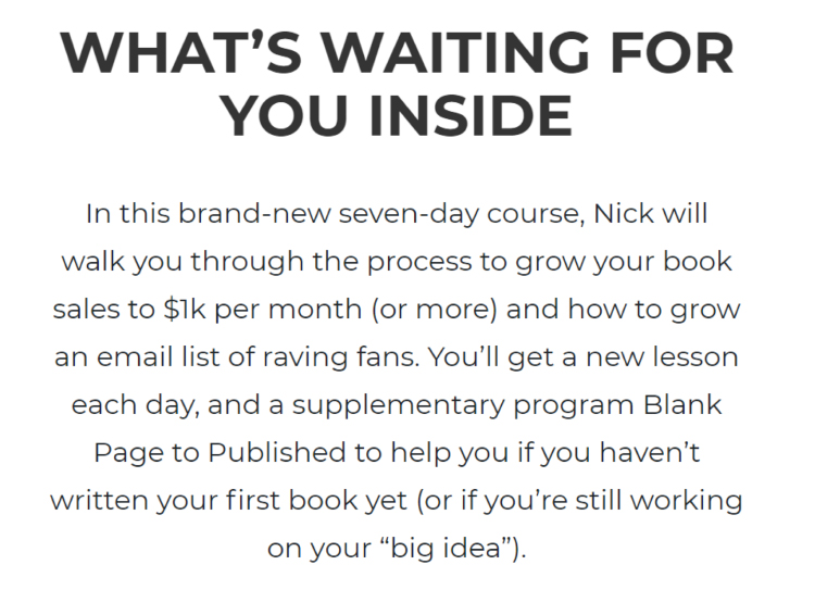
Then Nick introduces himself with a professional photo and a short bio:

Note how he uses his bio to boost his credibility by mentioning that:
- He’s a USA Today bestselling author.
- He has helped 75,000 authors grow their careers and book sales.
This helps to reassure the potential customer that they aren’t getting into a “the blind leading the blind” type of situation where someone who hasn’t sold any books is teaching people how to sell books (this happens all the time in the world of online marketing!).
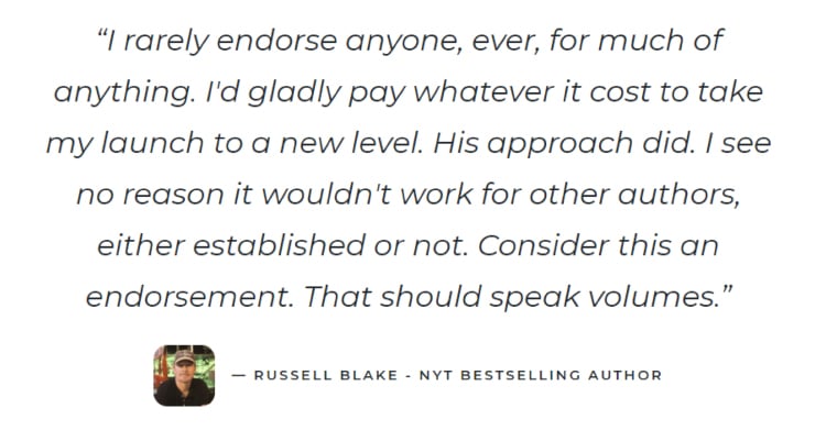
Then there’s another testimonial from a different NYT bestselling author. Note how Russell Blake saying that he “rarely endorses anyone, ever, for much of anything” makes you more likely to trust him. Clever!
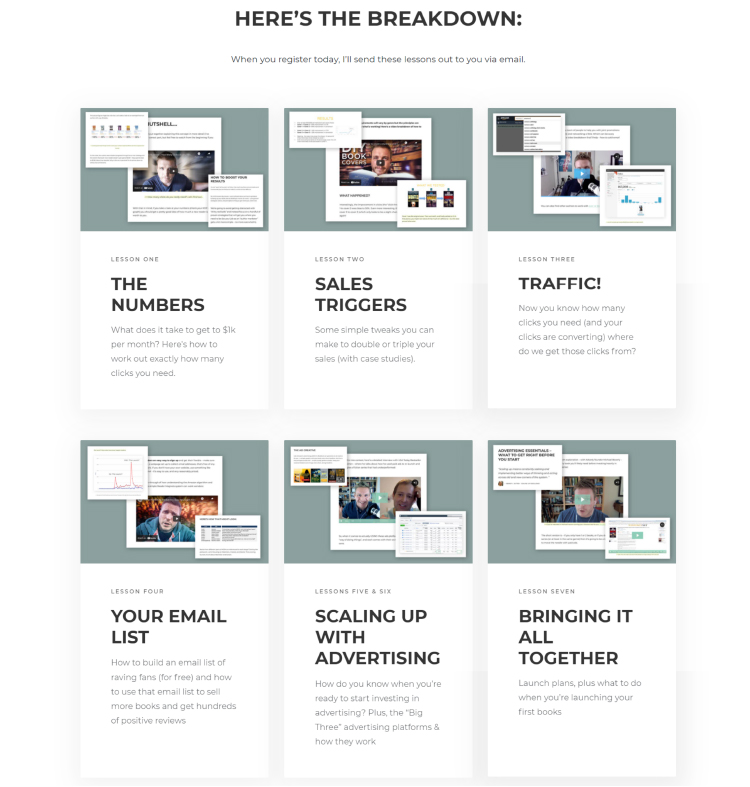
Below that testimonial there’s a breakdown of the course:
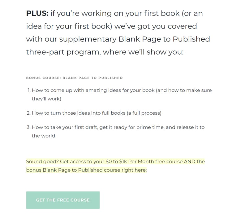
Then there’s information about the bonus course:
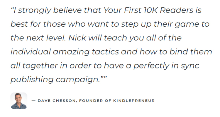
Then there’s another testimonial, this time from a well-known book marketing expert Dave Chesson who has been nicknamed “The Kindlepreneur” by Amazon:
Below there’s more information about what’s included in the course:
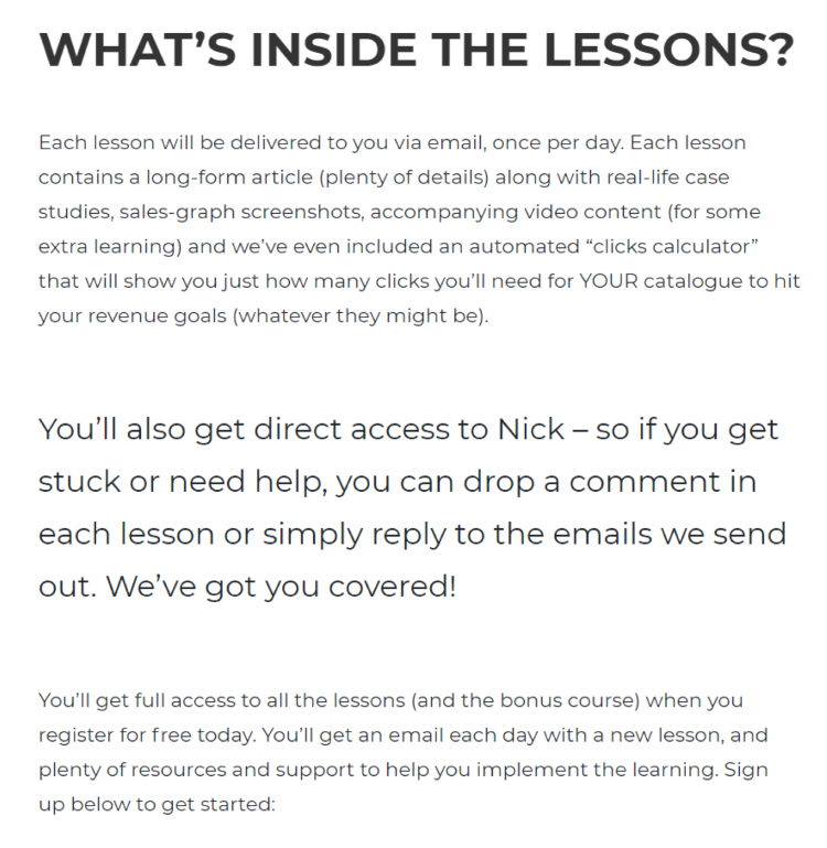
And then there’s the final call to action:
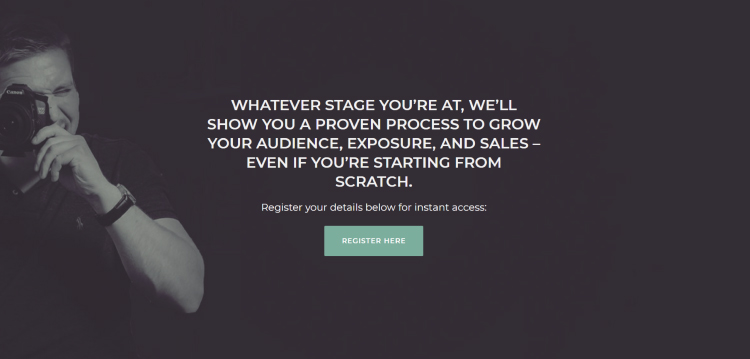
As you can see, not only has Nick created a super valuable lead magnet, he also put a ton of effort into “selling” it on its landing page.
We recommend you to follow his example. It’s the best way to approach the first stage of your sales funnel.
Landing Page Type #3: Long-Form Landing Pages
Long-form landing pages are longer than medium-length landing pages because they feature:
- Even more copy – There’s usually text that establishes an emotional connection with the potential customer + a backstory that establishes credibility + a detailed description of the lead magnet or the product.
- Even more images – These can include screenshots, customer photos, photos from events, images meant to break up the text, etc.
- Even more social proof – On top of the media badges, quotes, and regular testimonials there are often video testimonials as well, plus other relevant information (accomplishments, credentials, etc.).
Long-form landing pages are generally used to sell products since they can be an overkill for a lead magnet.
However, if your lead magnet requires more commitment from the potential customer than they are accustomed to, then a long-form landing page can make sense.
Example: Russell Brunson’s “Dotcom Secrets” Landing Page
Did you know that our co-founder Russell Brunson has written several great books?
We are giving them away for free as lead magnets. However, instead of offering potential customers free digital copies, we offer free physical copies instead. All we ask is that they cover the shipping cost.
Because we ask for a bigger commitment than is typical for a lead magnet, we have created long-form landing pages for each of the books to show potential customers their true value.
Take a look at the landing page for “DotCom Secrets”, Russell’s book about sales funnels.
Above the fold you see a headline, a subheadline, and a video:
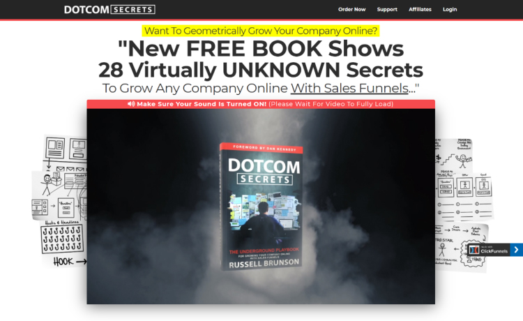
Right below the video there’s the first call to action.
Note how we reassure the potential customer by mentioning:
- A secure checkout
- A money-back guarantee
- The number of books sold
Plus, there’s also social proof in the form of media badges.

Then there’s another headline and subheadline:
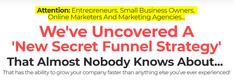
And then the copy starts with Russell telling the ClickFunnels story:
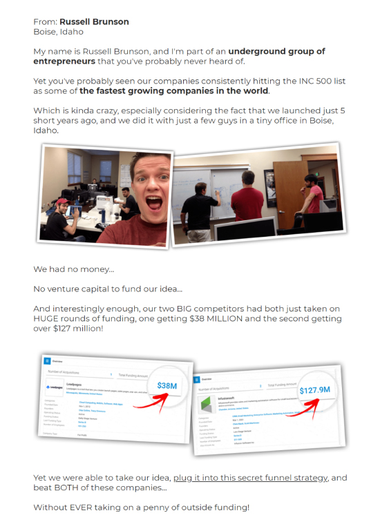
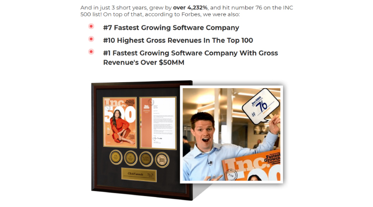
He then provides social proof by sharing that in just 3 years ClickFunnels has hit #76 on the INC 500 list.
He also mentions that the company was declared the #7 fastest growing software company, #10 highest gross revenues in the Top 100, and #1 fastest growing software company with gross revenue’s over $50MM by none other than Forbes.
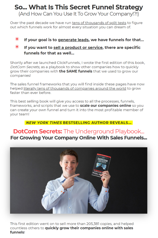
Then Russell switches his focus from ClickFunnels to the potential customer and introduces his book:
Then he introduces the “Two Comma Club” awards and shares photos from the events. This serves as social proof that what he teaches in the book works!
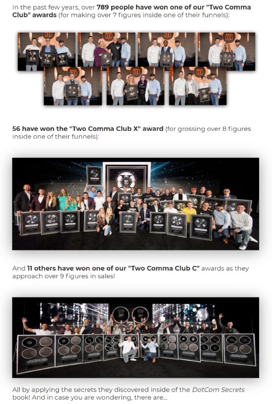
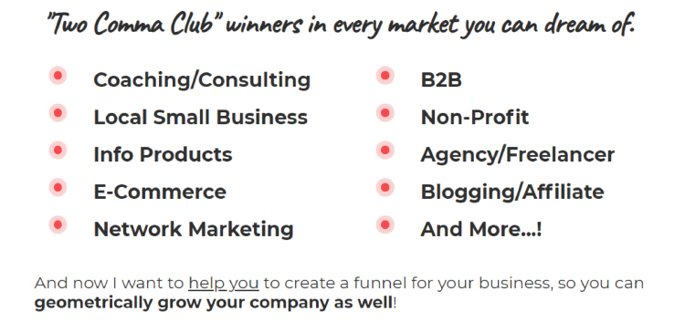
Then there’s a bulleted list that shows that there are “Two Comma Club” award winners in pretty much every market you can think of.
This reassures the potential customer that they too can benefit from the strategies Russell discusses in the book.
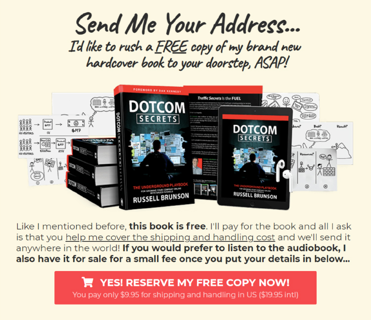
This bulleted list is immediately followed by a call to action:
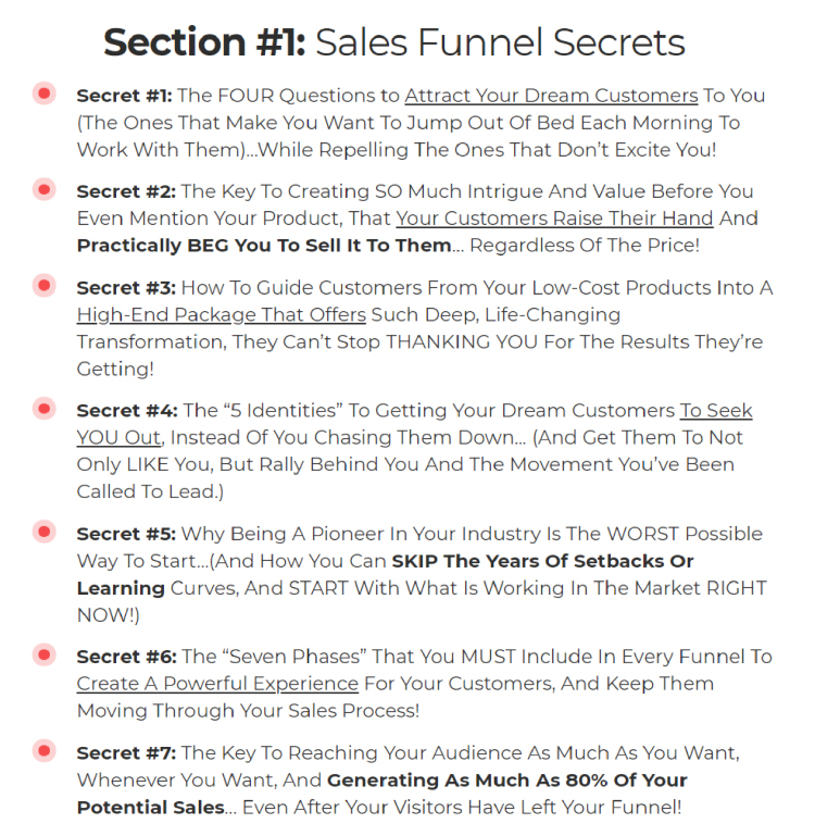
Then Russell describes every section of the book in great detail.
For example, here’s the description of the section #1:
Then there’s another call to action:
It is followed by four video testimonials.
Note how there’s also a quote above each video:

Then there’s another call to action:
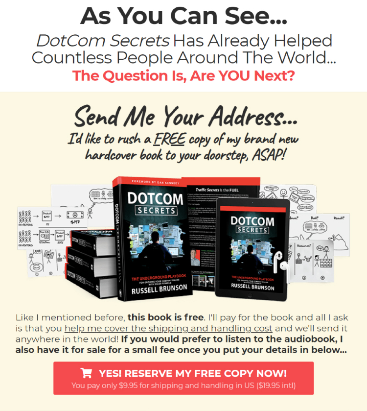
Then Russell lists all the free bonuses that the potential customer will get together with the book (there are five in total):
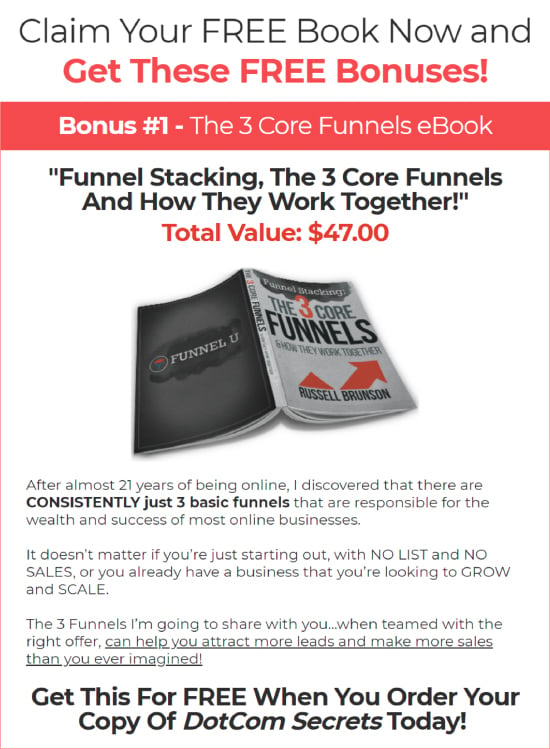
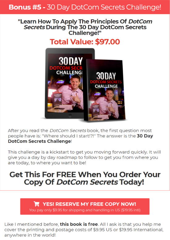
The description of the bonus #5 is followed by another call to action:
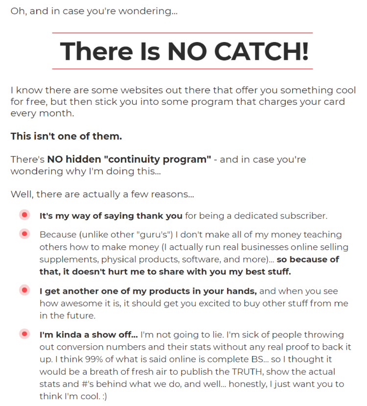
Then, just in case the potential customer is starting to get worried that this is too good to be true, Russell reassures them that there’s no catch:
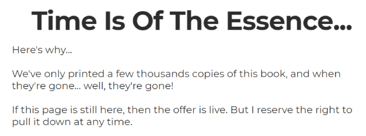
And then he reminds them that the number of copies is limited so if they want one they need to hurry up:
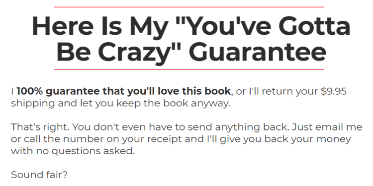
Then Russell provides a no-questions-asked money-back guarantee.
If the potential customer doesn’t love the book, we will refund them the shipping cost… And let them keep the book!
This guarantee doesn’t even have a time limit. You can get your money back anytime. There’s literally no financial risk in ordering a copy of “DotCom Secrets”.
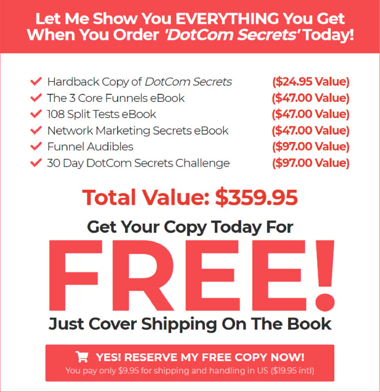
Then there’s a bold call to action that lists everything you will get if you order the book:
Russell then reminds the potential customer once again that the number of free copies is limited so they need to hurry up if they want one:
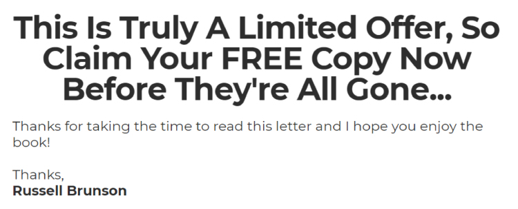
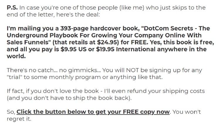
Below that there’s the P.S. section which summarizes the offer just in case the potential customer has skipped straight to the P.S.:
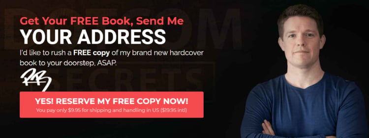
And then there’s the final call to action:
Finally, at the very bottom of the page, there’s the footer (they are important if you want to avoid legal trouble!):

As you can see, the landing page for “DotCom Secrets” is super long. So are the landing pages for Russell’s other two books.
But guess what? They convert!
New Landing Page Type: Video Landing Pages
Video landing pages are landing pages where the entire pitch is presented in a video format.
They are still quite rare but they are gaining popularity now that both hosting and streaming videos have become so easy.
Are you a natural in front of the camera? Then a video landing page might work well for you. It’s important to play to your strengths!
Example: Matthew Hussey’s “Attraction to Commitment” Landing Page
Matthew Hussey is a world-renowned dating coach who has over 2.2 million subscribers on YouTube.
Besides his YouTube career, he has also appeared on TV shows as well as made a variety of video courses. Needless to say, he is super comfortable in front of a camera.
Presumably, that is the reason why Matthew tends to use video landing pages for his products.
For example, here’s the sales page for his online course “Attraction to Commitment” (the video is 53 minutes long):
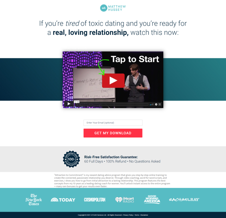
It’s worth noting that video landing pages work well for YouTubers not only because they are used to being on camera but also because their potential customers are used to seeing them on video.
Say, in Matthew’s case, it’s almost certain that someone who has decided to check out the “Attraction to Commitment” sales page has seen at least a few of his videos, so it makes sense to continue in the same format.
In fact, when your audience is heavily skewed towards people who prefer video to text (likely the case if you are a YouTuber), switching from video to a long-form sales page might be jarring to the potential customers.
Of course, the same also applies in reverse: if your potential customers are used to reading your essays and then they come to your sales page and there’s only a video of you talking, that might be jarring as well.
Conclusion
Now you know what the three types of landing pages are and when to use each one of them.
Putting what you have learned in this article into practice should help you generate more high-quality leads.
But keep in mind that generating leads is not enough.
You need to convert them into paying customers and then into repeat customers.
Our co-founder, Russell Brunson, has created a system for that. It’s called the Value Ladder sales funnel. Want to learn more about it?
Check out our 5 Day Challenge.
You will learn how to:
- Generate unlimited leads
- Create your first lead magnet
- Build your first sales funnel
- Create a simple 6-email follow-up sequence
- And launch your funnel
…in just five days!
So don’t hesitate.
