Nearly every marketer and entrepreneur in today’s world understands the need for landing pages. They’re a crucial part of your sales process, or even the whole process for some, yet not everyone truly understands the elements needed for a successful landing page
We all love awesome graphics, subconsciously or knowingly, which makes the background of your landing page all the more crucial as a part of it all. But when should you have a clean white background, when to use a fancy stock photo and when to draw something unique to be used as the background?
In this post, I’ll look into the different types of choices you have for the background, their uses and how to use them correctly to give your visitors that ‘OMG’ moment.
Solid colours, stock photos or drawings?

When building a new landing page, you need to consider the restrictions of your platform first. For example by using ClickFunnels you can easily choose the type of background you like, where as a landing page theme for WordPress might require some modification of code to accept custom images as the background.
This means you’ll need to pick the best possible foundation for your landing page before starting to build it. Plan your creation out, and only then jump into work on the platform of your choice. That way you can make sure the foundation is solid and multi-functional enough to support your vision.
Now that you have a solid foundation to build your landing page on, I’ll assume it can use a custom image as a background, instead of just a solid colour. At this point you’re ready to build your landing page.
Whether you decide to go with a solid colour as the background is completely up to you, but I’ll say this: It’s extremely hard to get a visitor go OMG about a basic blue background they’ve seen a thousand times before.
For a list of inspiring and exciting landing page designs that are sure to bring out the creative genius inside you (they certainly did so for me!), check out these two blog posts by Ginny Soskey and Lindsay Kolowich, which list a total of 26 extremely attractive landing page designs.
Take careful notice of their background choices. Basecamp is a good example of a very clean and minimalistic look, whereas Muck Rack goes for two separate images side by side. Basing the background on your own brand identity is important, as well as considering the desired impact.
A/B testing can be a great help if you’re trying to decide between the two choices, and can shed a lot of light on the impact that each background style has on your visitors.
The science of colour psychology

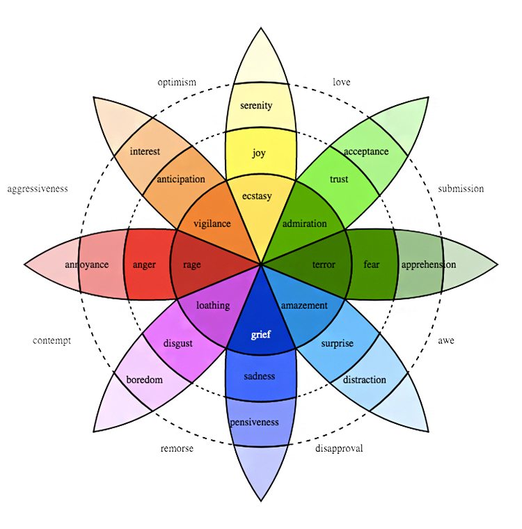
You can use colour psychology to benefit your business in many ways, one of which is by painting walls and decorating your office space according to certain psychological effects the different colours create.
But these same psychological principles also work with high efficiency on landing pages and websites in general, impacting the thoughts and emotions of your visitors.
Two of the more commonly used colours, apart from black, white and grey of course, are green and blue. And there’s a very good reason behind that.
Green is a colour that creates a sense of optimism and calm in a person. That’s why you can find it in many blogs, such as Brian Dean’s Backlinko.com. It can also improve the visitors reading speed and comprehension capabilities, so it is a common colour to be found online.
Blue on the other hand is a favourite colour to a ton of people that conveys a steady and stable environment, which translates into a huge potential with marketing materials and landing pages.
Therefore you can find blue as the main colour on multiple websites and landing pages, such as Wistia’s website.

By comprehending the different emotions and feelings colours can convey, you can go a long way in affecting your visitors’ actions and behaviour when visiting your landing page. But don’t forget testing different colours, because it’s really simple to switch colours!
Tools to create graphics that stand out from the masses
Now that we’ve covered the different colours that you can use, let’s take a look at creating some custom graphics for that landing page of yours.
Photoshop is an amazing tool for designers young and old, new and experienced, but it has a rather steep learning curve.
That’s why I suggest using Canva for making images that stand out nicely without spending too much time on the process.
Canva is a free web-based tool that you can use to create different graphics, and it comes with a number of premade dimensions that suit multiple purposes, like Facebook cover photos, blog post images and even infographics.
It also includes many free images and elements, but the selection mostly consists of paid elements and images, costing an affordable $1 each.
That means you can create a professional looking custom image using a one dollar stock photo, a one dollar graphics element and a couple of lines of text.
For two dollars, that’s quite the result, don’t you think?
You can also upload your own images and graphics to be used in Canva, free of charge naturally. Canva is an easy, free and function filled tool to create attention grabbers out of ordinary stock photos.
Finding amazing images
There are dozens of stock photo sites, such as Shutterstock and iStockphoto, and you can easily find free images by changing the Google image search filter to only show images with rights to reuse and modify.
What’s more important than where to look for background images, which can be easily found out about with Google and two searches, is to know what you’re looking for.
First of all, make sure the image matches your brand identity. Don’t use girls in bikinis if you’re promoting a mommy blog, or baby pictures for a manly man DIY blog.
Next up is figuring out the perfect layout, so that the image focuses the readers’ attention to certain parts of the copy. Use the image to boost the call to action’s effectiveness, not vice versa, by planning the layout so that the background doesn’t steal the CTAs attention.
Also make sure it conveys a message, as pointless images are… well, pointless.
Lastly, keep in mind that photos with humans in them make for a positive effect on visitors, and that makes for a strong boost with a single picture.
The ‘OMG’ effect
Having read what you’ve read by now, you most likely already understand what I mean by the OMG effect, but just to be sure here’s a quick focusing chapter about what it is and how you should aim for it.
- To begin with, pick out a background style to go with your brand identity and style. It needs to resonate with your target audience for it to be effective, and that’s why you should always split test everything before settling for one option over another.
- Following the choice of background, you’ll need to decide on the colour scheme. For this you can use either the colour you’ve already chosen for your website and brand, but you can also go for something different based on colour psychology.Make sure to have your images grab the attention of your visitor, and force their focus on to the main selling tool, i.e. the copywriting. That’s what convinces the visitor to buy from you in the end. But it doesn’t hurt to have a background that makes them go OMG!
The OMG effect in its simplicity means that the visitor will be admiring your background in awe and thinking to themselves: Oh My God.
Making the visitor go ‘OMG’

We’ve now covered how you can make your next visitors admire your landing page background, what tools you should use to get there and how to pick out the perfect stock photos. The process in itself is not that difficult, or anything special really, but it does take some thorough thinking to get to the best results.
You’ll need to consider many different aspects of choosing a background, from the type of background to the colour scheme and layout of your landing page, but the most important thing of all is to have a landing page.
There’s no background without a landing page, so get working on having one, right now using a simple ‘Opt In Funnel’ which you can try directly from ClickFunnels.
Do you have a resource that you use when generating backgrounds or making your visitors gog ‘WOW!’ when they hit your landing page? Drop us a line below!


Great advice Stephen! I love the particular part about the color psychology. This is so important and being the co-founder of a creative agency and a photographer myself, I know exactly just how important it is to also create the right brand image for your company. Thanks for sharing! In regards to my favorite tools, I actually like taking stock images or ones I took and editing them with photo apps like VSCO and Snapseed on my phone. Then, I upload them back to my computer and use them on our site.
They’re some great resources you’ve mentioned (be sure to add them to the blog post about your marketing stack). Couldn’t agree more though, you need to stand out from the crowd.
Hi Stephen, I hope you can assist me. About 6-12 months ago I read a post about a company that designs high converting landing pages/websites for the ClickFunnel community. Any help would be much appreciated.
Regards,
Kaz Emini
http://www.FinestDetail.com.au
Thank you for sharing. That's really good. I personally light blue color for my website.
vary good post.
Thank you for providing this helpful info. I understand the importance of best background landing pages.
Thank you 🙂
One of the best Idea you have given. Thanx a lot Stephen ♥ God Bless You ♥
Sumit, thank you so much for the positive feedback! Keep moving ahead
Great stuff. Very informative.